
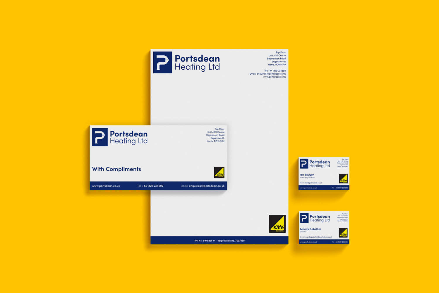
The brief for this project was to re-brand Portsdean Heating Ltd, to provide them with a fresh and cohesive identity that could be applied across printed materials. The route that I chose for the identity was based on pipework as it’s a material consistently used by the client’s engineers and is quickly associated with this industry. For the logo, I used the motion and bends of pipework to create the initial ‘P’ of the company name. I used the same blue bar across the bottom of the designs to clearly display relevant contact information, it also allows for a neat set of designs.
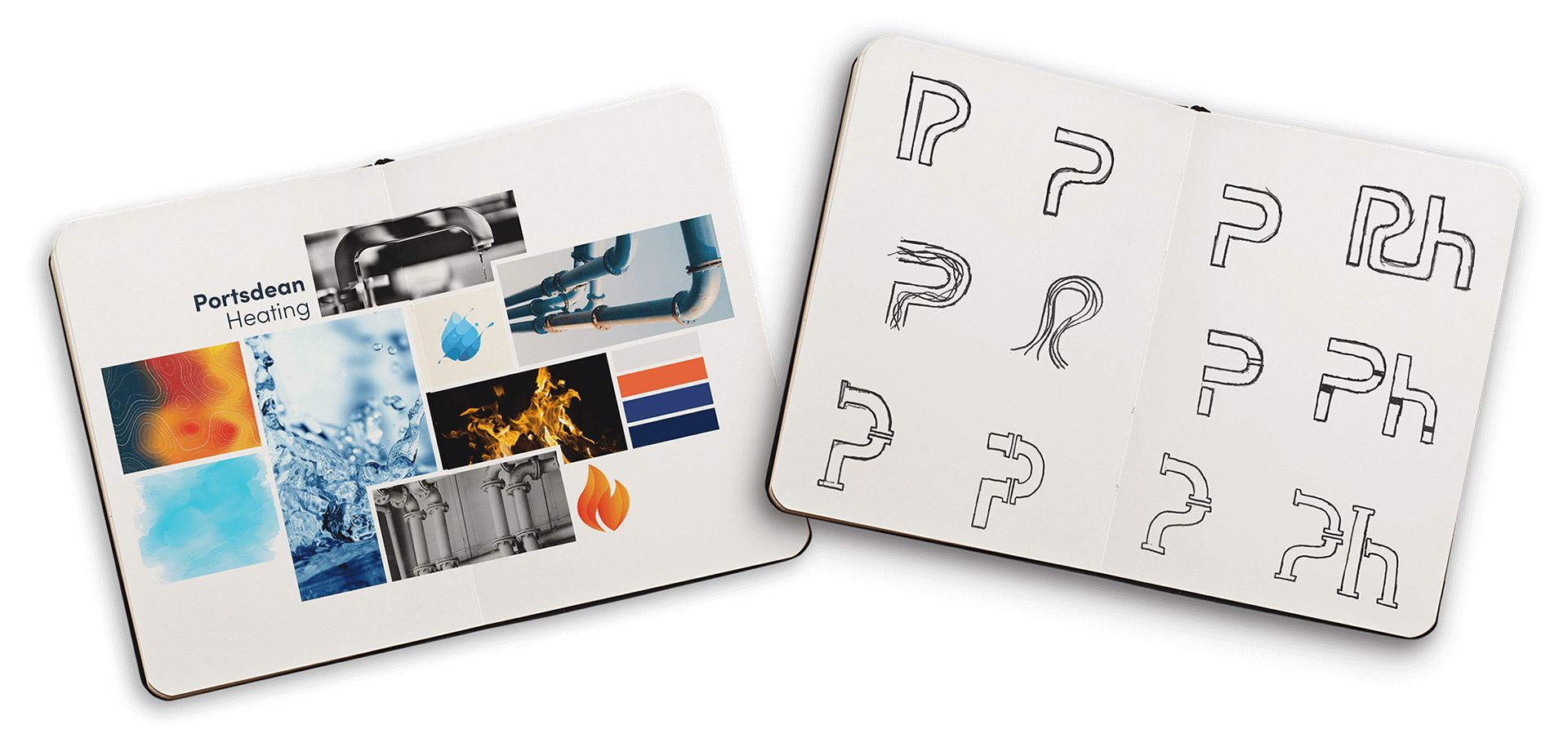
I began the project by creating a moodboard to show the client my visual inspiration for the branding. I thought about the materials, textures and colours associated with plumbing and heating and how this could be applied to an identity. I researched into pipework and the movement and connections of them which I then began to create sketches on.
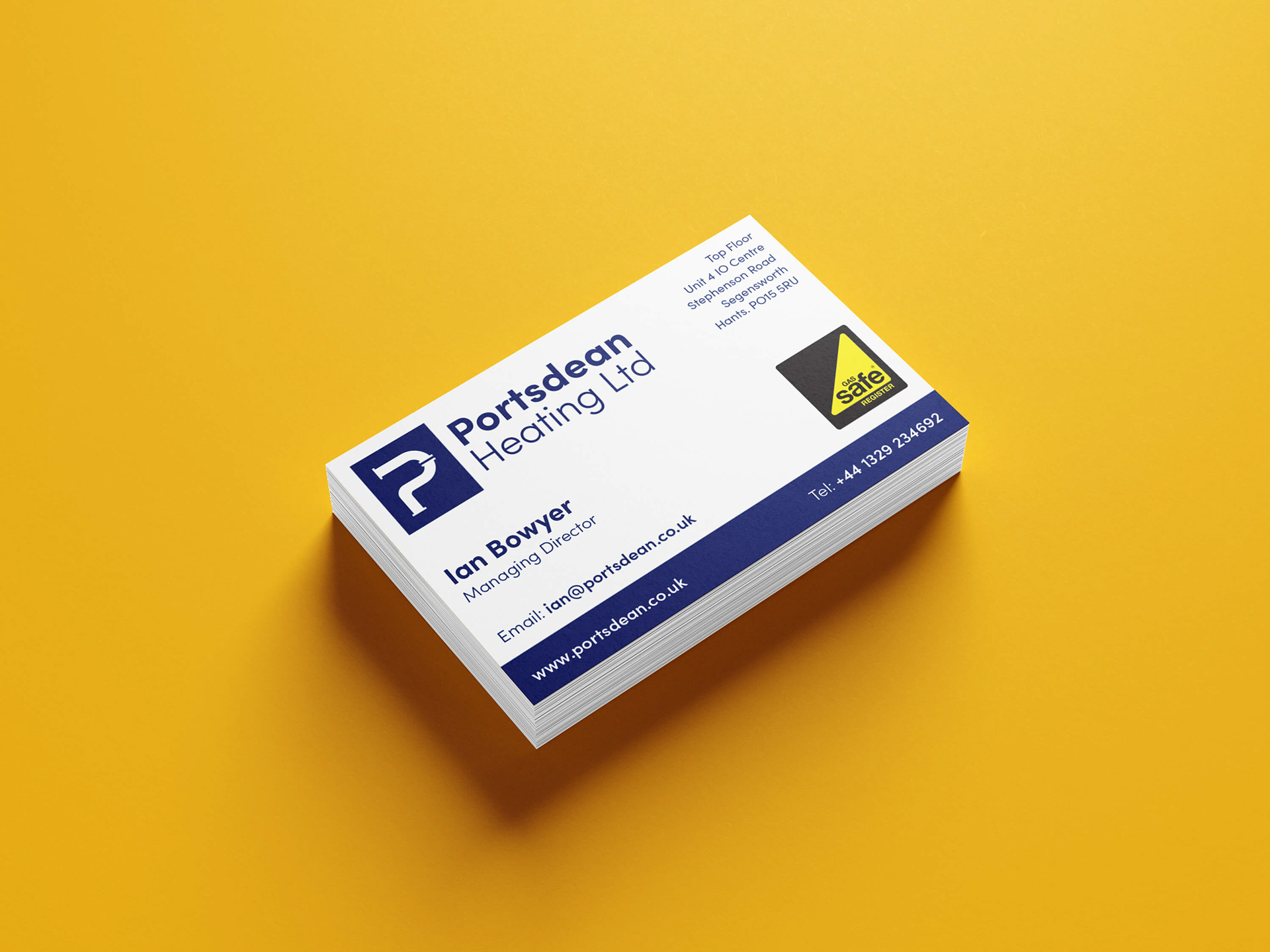
Business cards designed as part of a promotional materials pack. The client's specifications were that the card needed to be single-sided and the Gas Safe logo needed to be included and placed according to their brand guidelines.